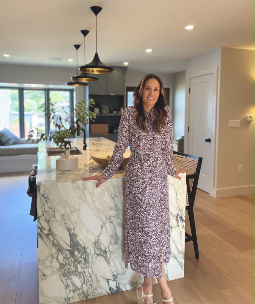
I’ve come to a point in my local life where I often see the portfolio of “after” photos of a newly renovated home and guess, with much accuracy, who the interior designer was. I’m not suggesting that I have a superpower, by any means. But it’s common that a designer becomes known in their local market for a certain aesthetic. The traditional interior designs of Caroline Cardone of Top Rail Interiors are no exception. So when I saw the modern space she created at a Birch Run residence in Saratoga Springs, I realized that she very successfully stepped out of that traditional box. With a result that not only thoroughly impressed me, but one that, well… made me very happy.
THAT SOMETHING IN BETWEEN
Most widely known for the design of the state-of-the-art 1863 Club at the Saratoga Race Course, Caroline welcomed the opportunity to do something a bit different. She happily accepted the challenge of transforming this 1980’s townhouse into a modern space that would be utilized by a young family. Fresh and comfortable were the two adjectives that came to mind when walking through the home with Caroline and homeowner Andi. “I’m often brought in to redo finishes. But this is much more fun, and a much better use of my skill set.” You see, Caroline thrives on reconfiguring spaces. After years of working for one of the most highly regarded local architectural design groups, Phinney Design Group, Caroline brings a LOT to the table (or the island). “I’m not a decorator, and I’m not an architect. I’m really something in between”.
And that was obvious when she brought me through the details of how she fully reworked this family’s space, taking full consideration of every aspect of their present day living. From widening narrow hallways that foreshadowed trouble with two active young boys, to knocking down kitchen walls to create a bright, open space. Caroline worked closely with the homeowner to create a comfortable living environment ready for casual living and entertaining. All while making sure to design around the Tom Dixon lighting that the homeowner had been ogling for years.
LIVING SPACES DESIGNED FOR JUST THAT
Homeowner Andi wanted something practical but reflective of her (fun yet dynamic) personality. The wall from the kitchen area to the living room was opened up to pink sectional seating, with Willy Wonka in the form of a donut mosaic bringing even more playfulness to the space.
Andi insisted that she only needed seating at the kitchen’s spacious island provided by Granite and Marble Works. But after some debate, Caroline successfully sold the idea of banquette seating with an interesting paneled wall feature. Opening directly to the living room, this space was able to accommodate a traditional mealtime together while keeping with the casual flow of the home. Pictured here, of course, with a banquette pillow by Betsy Olmsted, locally-based textile company and personal friend of Caroline’s.
BATHROOMS WORTH EXCUSING YOURSELF TO
Who would have thought that bathrooms could bring me so much happiness? This newly added powder room, just off the main hallway, was nothing short of amazing. The combination of green Concreti sink, brass fixtures and gorgeous Cole & Son wallpaper would have me locked in there for hours.
The “pink” master bath, although quite different in vibe than the powder room, made me a different kind of happy. Designing the space around this gorgeous slab of pink marble (also from Granite and Marble works), the rose tiled open air shower and light-toned wood brought a feminine element without reverting back to its 80’s roots.
SO CLOSE, YET SO FAR
After my visit with Caroline and Andi, we ventured just a few blocks away to Saratoga Golf and Polo Club, where Caroline could show me some of the more traditional design work that she’s done for their recent renovation. Most of her work was done in the new bar area, with hopes of inviting more usage and conversation to the space.
Layers of tweeds, leather club chairs and rich green velvets infused her signature Old World hunt club aesthetic in to this newly visited space. In an effort to utilize the previous bar (which had been relocated from a separate dining area) Caroline designed an accompanying back bar (built by Patrick Colaes of White Oak Woodworking ), providing both function and balance to the reconfigured space.
Caroline managed to create an inviting yet casual dining option for the growing younger membership, while paying homage to the traditionalists. A balance that most country club managers say is difficult to achieve.
And boy has she managed to achieve this, with members of every generation taking advantage of this updated dining area. One that was rarely used before this most recent design overhaul.
By simply walking the Birch Run space, I could hear the excitement in Caroline’s voice as shared the details of this “fun and different” project. And although I’ve always been a fan of Top Rail Interior’s traditional design aesthetic, it’s Caroline’s ability to nail this modern and fresh look that created a new super fan. And I’m confident, many more as well.
